
Breakpoint media-queries Chrome 插件, crx 扩展下载
Generate media-queries, show screen sizes width and link to a list of media-queries snippets.
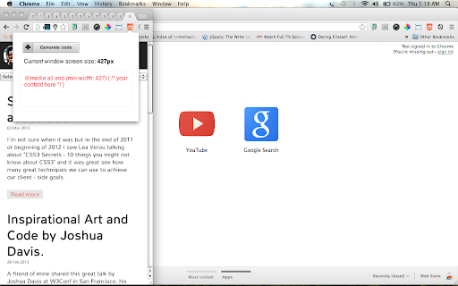
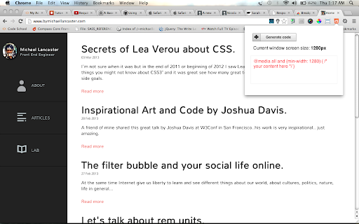
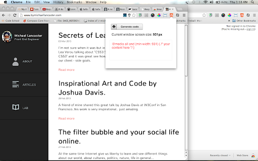
The extension generates media-queries for using max-width, helps you see the current screen size width and link you to a list of media-queries snippets.
1. Add the extension to your Google Chrome browser.
2. Start resize your window and see where your content are breaking.
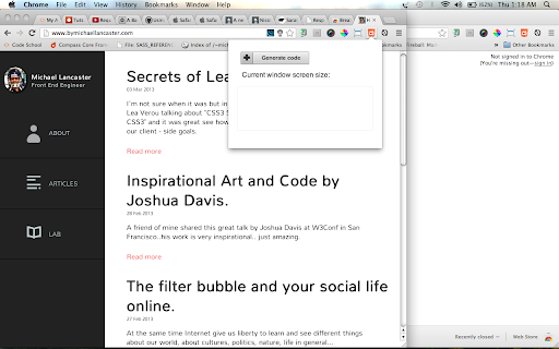
3. Click into the Breakpoint icon.
4. Click "generate code".
5. Copy the code generated.
6. Past into your style sheets.
Pretty simple and useful.
Version 1.0:
- removed Jquery
- re-built with vanilla javascript
Version 0.7:
- Design improvements.
Version 0.6:
- Design improvements.
Version 0.5:
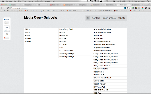
- Added external link to media-queries snippets with a bunch of devices.
- Design improvements.
Version 0.4:
- update from min-width to max-width.
Version 0.3:
- icon updated.
Credits:
Thanks to David Nemes for the Media-Queries Snippets.
| 分类 | 💻开发者工具 |
| 插件标识 | lgldclhgkdgddiopgbjkiememjlhjlng |
| 平台 | Chrome |
| 评分 |
☆☆☆☆☆
|
| 评分人数 | |
| 插件主页 | https://chromewebstore.google.com/detail/breakpoint-media-queries/lgldclhgkdgddiopgbjkiememjlhjlng |
| 版本号 | 8.3 |
| 大小 | 15.03KiB |
| 官网下载次数 | 1000 |
| 下载地址 | |
| 更新时间 | 2013-06-06 00:00:00 |
CRX扩展文件安装方法
第1步: 打开Chrome浏览器的扩展程序
第2步:
在地址栏输入: chrome://extensions/
第3步: 开启右上角的【开发者模式】
第4步: 重启Chrome浏览器 (重要操作)
第5步: 重新打开扩展程序管理界面
第6步: 将下载的crx文件直接拖入页面完成安装
注意:请确保使用最新版本的Chrome浏览器