
Responsive Website Testing Toolkit - Multiple Viewport Simulator Chrome 插件, crx 扩展下载
An essential tool to test the responsiveness of any website on multiple screens simultaneously
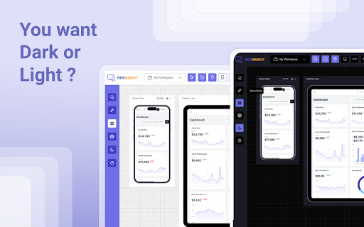
Simplify your web development and testing journey with Responsive Website Testing Toolkit, a comprehensive solution built to enhance testing, collaboration, and project organization. An advanced multi-device responsiveness testing tool that empowers developers and designers to work smarter and faster.
Key Features:
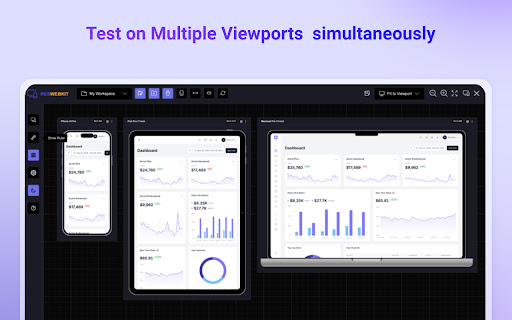
1. Test Responsiveness Across Multiple Viewports Simultaneously
Instantly preview your website on multiple devices in real time. Responsive Website Testing Toolkit lets you view layouts on smartphones, tablets, desktops, and more, helping you deliver pixel-perfect designs for every screen size.
2. Sync Mouse Clicks and Scroll Events Across Viewports
Test interactivity like never before! Sync mouse clicks, and scroll events across all viewports simultaneously, ensuring a seamless user experience across devices.
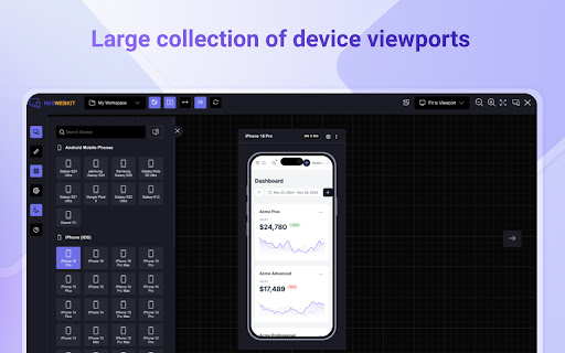
3. Customizable Viewports for Every Need
Design and test for any screen size with ease. ResponsiveSync Pro allows you to create custom viewports tailored to unique device requirements, giving you the flexibility to tackle any project.
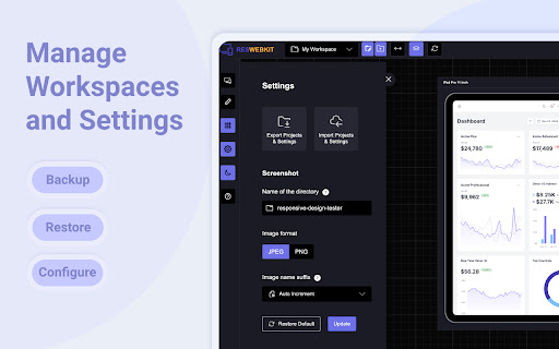
4. Workspaces for Efficient Project Management
Stay organized with dedicated workspaces for every project. Manage viewports, configurations in a single, user-friendly interface, making multi-project management a breeze.
5. Export and Import Projects and Settings
Seamlessly collaborate with your team or transfer projects between environments. Responsive Website Testing Toolkit supports exporting and importing projects and settings, ensuring continuity and productivity across your workflow.
6. Capture Screenshots Instantly
Document and share progress with one-click screenshot capabilities with or without the device Mockup.
Besides above mentioned key features there are more features to explore. We are actively working to introduce new features in a regular interval and improve the quality of the application.
Why Choose Responsive Website Testing Toolkit?
✅ Save Time: Simultaneous multi-device testing accelerates your workflow.
✅ Work Smart: Advanced features like synced actions and project exports boost efficiency.
✅ Be Flexible: Customize viewports and configurations to fit any requirement.
✅ Stay Organized: Streamline project management with intuitive workspaces.
Take your responsive web development and testing to the next level with Responsive Website Testing Toolkit, the all-in-one tool that delivers precision, flexibility, and convenience.
For any suggestions or feature request please reach out to us via the email which mentioned in the developer info.
Privacy Policy: https://rbrahul.github.io/privacy/responsiveness-webkit/
| 分类 | 💻开发者工具 |
| 插件标识 | pahjcficmhfgjkdcdadnacjdiinpilmd |
| 平台 | Chrome |
| 评分 |
★★★★☆
4.2
|
| 评分人数 | 308 |
| 插件主页 | https://chromewebstore.google.com/detail/responsive-website-testin/pahjcficmhfgjkdcdadnacjdiinpilmd |
| 版本号 | 1.0.0 |
| 大小 | 170KiB |
| 官网下载次数 | 492 |
| 下载地址 | |
| 更新时间 | 2024-12-26 00:00:00 |
CRX扩展文件安装方法
第1步: 打开Chrome浏览器的扩展程序
第2步:
在地址栏输入: chrome://extensions/
第3步: 开启右上角的【开发者模式】
第4步: 重启Chrome浏览器 (重要操作)
第5步: 重新打开扩展程序管理界面
第6步: 将下载的crx文件直接拖入页面完成安装
注意:请确保使用最新版本的Chrome浏览器
同类插件推荐

Responsive Website Testing Toolkit - Multiple Viewport Simulator
An essential tool to test the responsiveness of an

U-Eyes: Mobile Device Simulator
Simulate mobile devices for responsive testing, mo

Mobile View: Test responsive designs fast
Test your responsive designs on multiple devices a

视口调整器:终极设备模拟器和网站测试工具
使用这款先进的测试和演示工具模拟设备、调整屏幕大小,并轻松完善您的网页设计。通过我们的动态测试和展示