
Responsive viewer For Chrome Chrome 插件, crx 扩展下载
View multiple screens simultaneously With Responsive viewer For Chrome
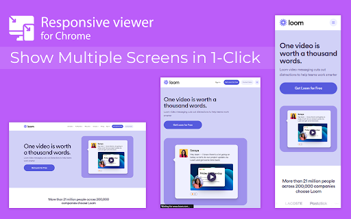
In 2025, ensuring your website looks flawless across all devices is more important than ever. Don’t let your website look ugly when viewed in different devices, you can use Responsive Viewer for Chrome extension. As a device necessary for developers, you have the ability to display several sizes on the screen at once, which makes testing of work in responsive design faster. With two to three clicks, assess and improve broad site structure across different screens, for the best usability.
Key Features:
Multiple Screens in One View: See all the screen resolutions on one page, from mobile-first to desktop-first, if you want to test responsiveness.
Quick Layout Assessments: Exhibit 2 A time saver delivering layout problems in real time respecting device, screen and orientation.
Customizable Configurations: Make your screens, specific resolutions, and spatial orientations correspond with the intended devices.
Enhanced Development Workflow: Be able to easily identify and address problems regarding responsiveness in order to enhance the design operation.
How to Use:
Install the Extension: To get the Responsive Viewer Chrome Extension, go to Chrome Web Store and install it.
Open the Website or App: Open the website or the application that you wish to and it ready for testing.
Activate Responsive View: In your Chrome bar you will see the icon of Responsive Viewer.
Customize View: Orientation and scaling and resizing options are available to help the user in specific and more detailed forms of testing.
Review and Optimize: Make sure that the same layout appears uniformly in all your displays and adjust your site in terms of how well it is user-friendly on each of the devices.
Test with Ease: To minimize discrepancies in performance across different devices, the configurations have to vary.
Why Use Responsive Viewer?
As was described, the Responsive Viewer is intended to simplify the work of testing responsiveness. Developers and designers can now check how their designs work on various devices without flipping between screens. Cut hours off your schedule, make your work more efficient, and make your users’ experience on any device seamless.
FAQs
What is the Responsive Viewer extension?
The Responsive Viewer is a Chrome extension that allows developers to view multiple screen resolutions simultaneously, making it easier to test website responsiveness.
Can I customize screen sizes and orientations?
Yes, you can easily customize the screen sizes, orientations, and resolutions to match the devices you’re testing.
Is it free to use?
Yes, the Responsive Viewer is free to install and use for all Chrome users.
Does this work with any website?
Absolutely! You can test responsiveness on any website or web application by simply activating the extension.
Who can benefit from this extension?
Web developers, designers, and anyone working on responsive web designs will find this tool invaluable for quick and accurate layout testing.
| 分类 | 📝工作流程与规划 |
| 插件标识 | geaeebooindfocegjgdfjkbmkekcpobd |
| 平台 | Chrome |
| 评分 |
★★★☆☆
3.1
|
| 评分人数 | 75 |
| 插件主页 | https://chromewebstore.google.com/detail/responsive-viewer-for-chr/geaeebooindfocegjgdfjkbmkekcpobd |
| 版本号 | 0.0.1 |
| 大小 | 25.34KiB |
| 官网下载次数 | 3000 |
| 下载地址 | |
| 更新时间 | 2025-01-23 00:00:00 |
CRX扩展文件安装方法
第1步: 打开Chrome浏览器的扩展程序
第2步:
在地址栏输入: chrome://extensions/
第3步: 开启右上角的【开发者模式】
第4步: 重启Chrome浏览器 (重要操作)
第5步: 重新打开扩展程序管理界面
第6步: 将下载的crx文件直接拖入页面完成安装
注意:请确保使用最新版本的Chrome浏览器
同类插件推荐

Be Responsive
Be Responsive helps you to build smooth and respon

Responswitch
Test responsive design of any web page with one cl

Desktop - Mobile Responsive Testing Tool
All-in-one Chrome extension for SEO, UI/UX, respon

Responsive View
To view the page in different device screen sizes,

Responsive viewer For Chrome
View multiple screens simultaneously With Responsi

Mobile View: Test responsive designs fast
Test your responsive designs on multiple devices a

Pixefy - Responsive Design Checker
Pixefy is a powerful tool for responsive design te

Website Responsiveness Checker
Optimize your website for all devices with website

Responsive Debug
A chrome extension for testing responsive web page

Responsive design tester
Test your websites responsivness**THERE ARE 2 ISSU

Responsive Tester
Test responsive web designs or mobile pages and se

Responsive Window
Making responsive design a little bit easier.Wheth

视口调整器:终极设备模拟器和网站测试工具
使用这款先进的测试和演示工具模拟设备、调整屏幕大小,并轻松完善您的网页设计。通过我们的动态测试和展示