
Desktop - Mobile Responsive Testing Tool Chrome 插件, crx 扩展下载


All-in-one Chrome extension for SEO, UI/UX, responsive design, grammar, and security checks. Optimize websites with a single click.
? Elevate Your UI Testing & Responsive Design with WebOpt!
Tired of endless troubleshooting across devices?
Say goodbye to UI and responsive design headaches with WebOpt – the ultimate tool for ensuring your website looks perfect and performs seamlessly on any screen size. Whether you're testing for desktop, tablet, or mobile, WebOpt has got you covered!
Frustrated with the constant battle of making your website look perfect on every device?
Put an end to the guesswork with WebOpt – your ultimate companion for flawless UI testing and responsive design. Whether it’s a desktop, tablet, or smartphone, WebOpt ensures your website shines across all screens.
✨ Key Features:
? Multi-Device Responsive Testing:
Ensure your design looks stunning on every device. WebOpt allows you to test responsiveness across multiple screen sizes and resolutions, providing instant feedback on how your site adapts to different environments.
? Network Capture & Analysis:
Track every network request your website makes, from initial load to resource fetching. WebOpt captures network traffic during your tests, allowing you to analyze load times, response times, and the efficiency of your site’s performance.
? Response Time Calculation:
Get precise metrics on network response times. Understand how your website performs under different conditions and pinpoint areas that need optimization. With detailed charts and insights, you can ensure a fast, user-friendly experience for your visitors.
? Network Monitoring Charts:
Track your website’s network performance with WebOpt’s detailed monitoring charts. These charts offer clear insights into network activity, including load times and response times, helping you pinpoint bottlenecks and optimize your site’s speed and efficiency. With WebOpt, you can ensure that your website delivers a smooth and fast user experience across all devices.
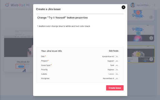
? Issue Reporting:
Capture issues directly from your tests and create detailed reports with ease. WebOpt integrates seamlessly with Jira, Slack, Notion, ClickUp, Asana, GitHub, and GitLab, enabling you to track and manage issues within your existing workflow. Simply click to document and assign issues, ensuring nothing slips through the cracks.
? Screenshot Capture & Editing:
Capture and edit screenshots of your tests in real-time. Highlight issues with tools like pencil, square markers, and text annotations. Make your reports clear and actionable with visual evidence of every issue.
? Why Choose WebOpt for UI Testing?
✔️ Real-Time Feedback: See how your site performs across devices instantly, saving you hours of testing time.
✔️ Detailed Network Insights: Track every request, response time, and potential bottleneck with precision.
✔️ User-Friendly Interface: Navigate complex UI and responsive testing tasks with ease, thanks to our intuitive design.
| 分类 | 💻开发者工具 |
| 插件标识 | hfbimofcfbhkdfkjcgklmkmcnhkpddeh |
| 平台 | Chrome |
| 评分 |
★★★★☆
4.7
|
| 评分人数 | 40 |
| 插件主页 | https://chromewebstore.google.com/detail/desktop-mobile-responsive/hfbimofcfbhkdfkjcgklmkmcnhkpddeh |
| 版本号 | 2.0 |
| 大小 | 4.09MiB |
| 官网下载次数 | 321 |
| 下载地址 | |
| 更新时间 | 2025-02-24 00:00:00 |
CRX扩展文件安装方法
第1步: 打开Chrome浏览器的扩展程序
第2步:
在地址栏输入: chrome://extensions/
第3步: 开启右上角的【开发者模式】
第4步: 重启Chrome浏览器 (重要操作)
第5步: 重新打开扩展程序管理界面
第6步: 将下载的crx文件直接拖入页面完成安装
注意:请确保使用最新版本的Chrome浏览器
同类插件推荐

Desktop to Mobile Screen Preview
Quick open website which you are using on desktop

Be Responsive
Be Responsive helps you to build smooth and respon
Mobile View Tester: Responsive Web Design Tool
Mobile-first design validation. Quickly preview an

Responsive Website Testing Toolkit - Multiple Viewport Simulator
An essential tool to test the responsiveness of an

Desktop - Mobile Responsive Testing Tool
All-in-one Chrome extension for SEO, UI/UX, respon

Responsive viewer For Chrome
View multiple screens simultaneously With Responsi

U-Eyes: Mobile Device Simulator
Simulate mobile devices for responsive testing, mo

Mobile View: Test responsive designs fast
Test your responsive designs on multiple devices a

Pixefy - Responsive Design Checker
Pixefy is a powerful tool for responsive design te

Website Responsiveness Checker
Optimize your website for all devices with website

Responsive design tester
Test your websites responsivness**THERE ARE 2 ISSU

Mobile simulator - responsive testing tool
Smartphone and tablet simulator on computer with s

视口调整器:终极设备模拟器和网站测试工具
使用这款先进的测试和演示工具模拟设备、调整屏幕大小,并轻松完善您的网页设计。通过我们的动态测试和展示