
Responsive Buddy Chrome 插件, crx 扩展下载

Test mobile layouts of your web pages in 2 clicks.
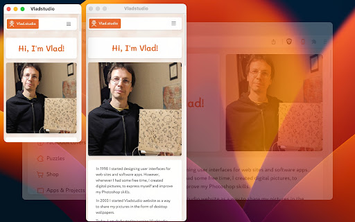
As a web developer, I need to constantly check my designs on large and small screens. I tried many Chrome extensions that test responsive designs, but most of them were too bloated or inconvenient. So I created my own. I've been using it daily, so I thought – why not publish it, maybe it will be useful for you too!
~*~ 3 PHONES, 3 TABLES ~*~
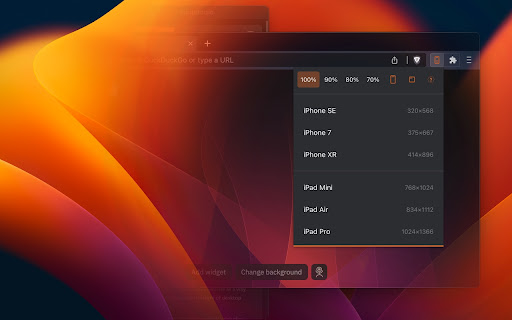
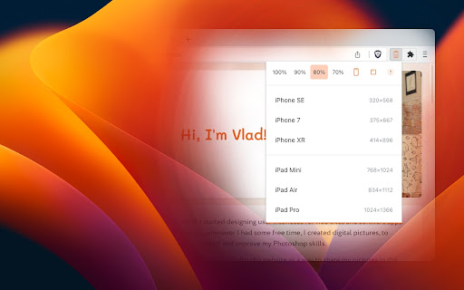
Most extensions require that I configure my own list of favorite devices. Responsive Buddy offers 3 phone and 3 tablet sizes, from small to large.
~*~ ZOOM OUT (100 to 70%) ~*~
Useful if you want to compensate the difference between your monitod DPI (pixel density) and the DPI of a target mobile device.
~*~ PORTRAIT / LANDSCAPE ~*~
Switch between portrait and landscape orientation with a click of a button.
~*~ IFRAME MODE OFF BUTTON ~*~
By default, Responsive Buddy creates a window with an iframe, then transforms it to the selected zoom setting. It works well, unless your website refuses to be opened in an iframe. If that's the case, you can turn "iframe mode" off.
~*~ DARK MODE SUPPORT ~*~
Your eyes will thank you!
| 分类 | 💻开发者工具 |
| 插件标识 | pkpodanfippddohhfchdmebebbepjkkf |
| 平台 | Chrome |
| 评分 |
★★★★☆
4
|
| 评分人数 | 2 |
| 插件主页 | https://chromewebstore.google.com/detail/responsive-buddy/pkpodanfippddohhfchdmebebbepjkkf |
| 版本号 | 1.0.1 |
| 大小 | 32.9KiB |
| 官网下载次数 | 108 |
| 下载地址 | |
| 更新时间 | 2023-01-30 00:00:00 |
CRX扩展文件安装方法
第1步: 打开Chrome浏览器的扩展程序
第2步:
在地址栏输入: chrome://extensions/
第3步: 开启右上角的【开发者模式】
第4步: 重启Chrome浏览器 (重要操作)
第5步: 重新打开扩展程序管理界面
第6步: 将下载的crx文件直接拖入页面完成安装
注意:请确保使用最新版本的Chrome浏览器
同类插件推荐
Vlad.studio New Tab
Make your New Tab page unique with widgets and bac

Be Responsive
Be Responsive helps you to build smooth and respon

Desktop - Mobile Responsive Testing Tool
All-in-one Chrome extension for SEO, UI/UX, respon

Responsive View
To view the page in different device screen sizes,

Responsive Buddy
Test mobile layouts of your web pages in 2 clicks.

U-Eyes: Mobile Device Simulator
Simulate mobile devices for responsive testing, mo

Pixefy - Responsive Design Checker
Pixefy is a powerful tool for responsive design te
![Pipe - Responsive screen viewer [Beta]](https://www.chajianmi.com/images/WM0kbGEZtAXSAQ7sKcW1KaZ2iIGFWZojZMv4nY2uYjnZUYHekfUYcbEV13qA_-jbobNBsqxA27H3h5WcUNo341RZ=s275-w275-h175)
Pipe - Responsive screen viewer [Beta]
Open multiple devices screens for test or debug a

Responsive Debug
A chrome extension for testing responsive web page

Page-oscope by MobileMoxie
Compare rendered & un-rendered page code of mo

Responsive design tester
Test your websites responsivness**THERE ARE 2 ISSU

视口调整器:终极设备模拟器和网站测试工具
使用这款先进的测试和演示工具模拟设备、调整屏幕大小,并轻松完善您的网页设计。通过我们的动态测试和展示

Responsive Viewer
Show multiple screens once, Responsive design test